Redesigning an NGO's website to streamline the donation process
Website Redesign
Role
UX Designer
Industry
NGO
Duration
4 months


The Home page lacks key information, with the banner dominated by quotes instead of details about the NGO. The mission and vision are only visible after scrolling. The About Us page includes just the founding story, and users must click ‘Initiatives’ to learn about the NGO’s work. Adding more history and reorganizing content would improve clarity.
I conducted user tests to evaluate the donation flow and found that most users experienced confusion and required guidance to navigate the donation process.
Competition analysis
Looking at the donation pages on the websites of other NGOs, I noticed they had preset amounts to make decisions easier for potential donors. Furthermore, I noticed that other websites have a more prominent donate button on the top bar. These design choices considerably improve the user experience of their respective websites, so I decided to incorporate them into my design as well.


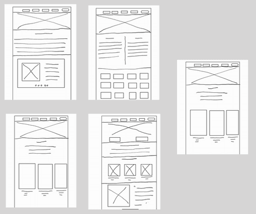


High-Fidelity Prototypes
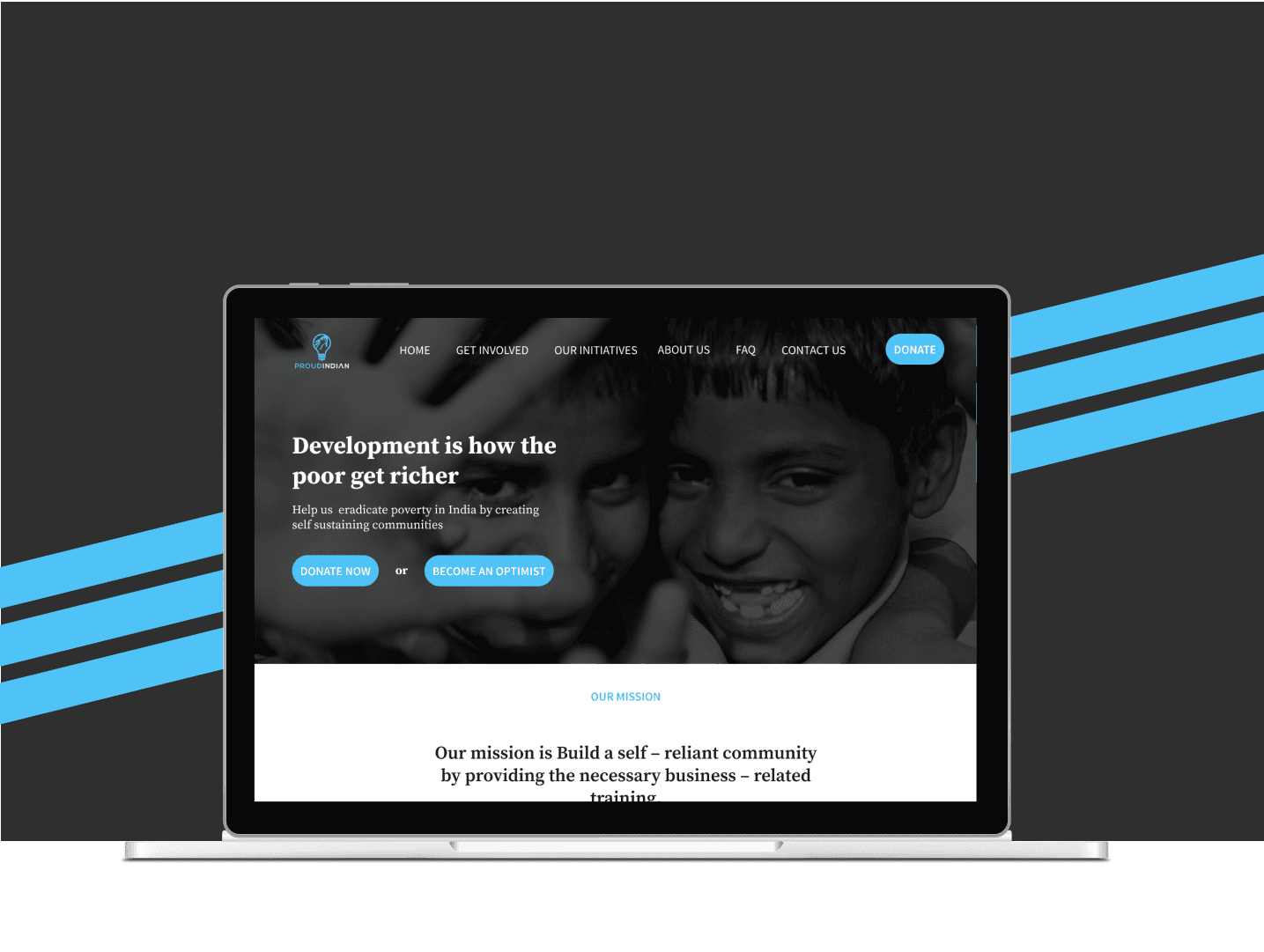
Home Page
I reorganized the information on the home page by moving the vision and mission statement to the top of the page. The banner was combined with the top bar to give it a more modern look and the donate button was emphasized more.
Volunteer Page
For this page, I placed the various volunteering opportunities at the top of the page. I also added the testimonials at the bottom of the page since it is not the most important information.
Our Impact Page
I reorganized the text of the two overarching schemes. I also changed the areas to cards for a modern look. The various solutions are presented in a side-scrolling fashion as opposed to vertical scrolling to save space and separate them from the rest of the content.
About Us Page
I moved the event photos, which were on the Volunteer page, to the About Us page.
Donations Page
I simplified the donation page to remove the clutter, added the custom amount at the top, and put the existing tiers below it as optional plans.
Conclusions
This project was one of my first projects which were not personal. Although I worked alone, I learned the importance of communicating with the stakeholders, understanding their requirements, and collating them with the users. Overall, despite only having three weeks, I am happy that I was able to deliver the designs to the NGO