HapViz - Visualizing haptic signal descriptions
Role
Designer and Developer
Industry
Academia, tech
Duration
4 months

How it works
Used GPT-4 to extract key sensory, emotional, and associative keywords from 7,680 descriptions.
Grouped keywords into categories and calculated emotional scores using the NRC Lexicon (based on Plutchik’s emotion model).
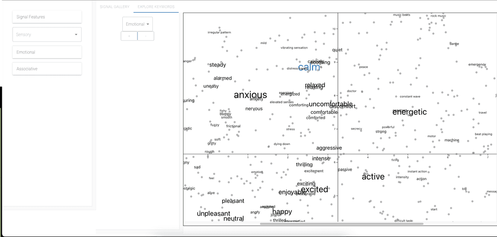
Created semantic maps with SBERT word embeddings + multidimensional scaling, so related words cluster together visually.
Views created
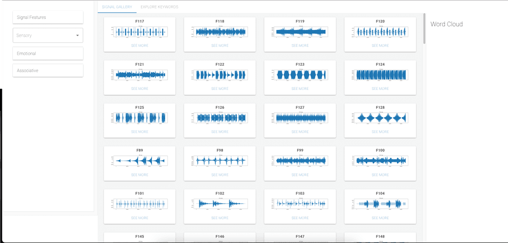
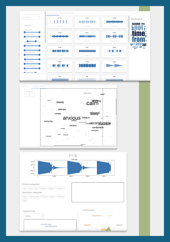
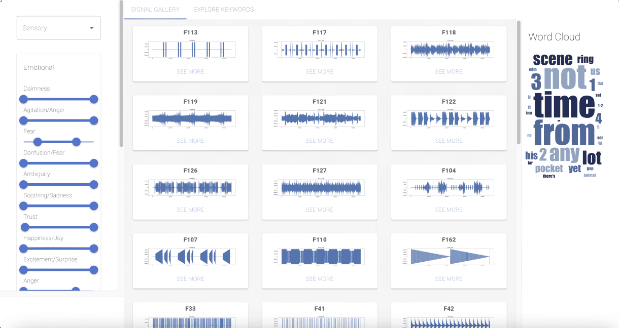
The dashboard view allows users to see all signals at a glance. The filters at the panel on the side allows users to filter by sensory, emotional, and associative properties
The plot of all keywords allows users to analyze and select keywords that were used to describe signals. The view can be changed according to the category.
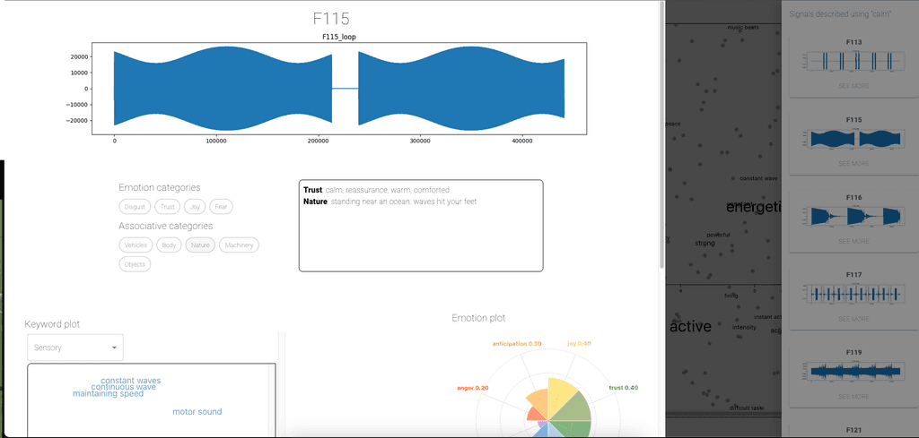
The signal panel allows users to see the properties of the signal. They can select categories and view individual keywords. They can also see the emotions associated with each signal.
Why it’s valuable
Haptic feedback is widely used to improve UX, accessibility, and navigation cues in multimodal applications. By mapping how people describe haptic signals, this tool helps:
Designers match signals to desired sensations or emotional effects.
Researchers explore language–tactile relationships and train predictive models.
Teams discover patterns in perception that might otherwise stay hidden.
The result is an intuitive, visual, and data-driven way to navigate the subtle language of touch
Other projects
Redesign project: fitness tracker App Revamp
HapViz - Visualizing haptic signal descriptions
Redesign project: fitness tracker App Revamp
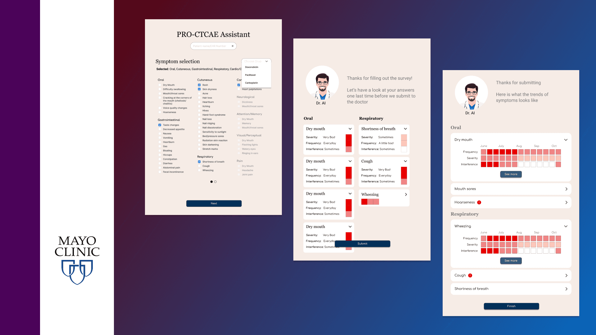
Helping Cancer patients report and visualize their symptoms

Redesign project: fitness tracker App Revamp
Enabling renewable energy professionals to make critical decisions

Redesign project: fitness tracker App Revamp
Fittrack - a fitness app