Helping Cancer patients report and visualize their symptoms
Helping Cancer patients report and visualize their symptoms
Role
UX Designer
Industry
Healthcare
Duration
4 months
Co-design
We decided to design two patient endpoints:
A mobile application that allows users to report any symptoms between clinic visits and send them directly to their physicians
A chatbot for the table that provides a chatbot that users can interact with to report their symptoms and visualize their progress
This decision was made after involving physicians from the Mayo Clinic, including clinical trial operation specialists and oncologists. We created sketches, visceral storyboards using Lego blocks, and visited the clinic to observe the processes that the patients go through.
The biggest challenge was service design to align patient needs with Mayo Clinic's processes and systems. While patients filled out the PRO-CTCAE at the clinic before their scheduled checkups, oftentimes they forget or overlook symptoms that sporadically appear between sessions. A mobile app to report symptoms from home and send it directly to their doctor would help solve this gap.
When a patient comes for their checkup and waits to see their physician, they are required to fill out the PRO-CTCAE, which the doctor then reads to assess how their symptoms have progressed. Patients are often extremely fatigued from their chemotherapy, and designing a comforting, empathetic experience was necessary.
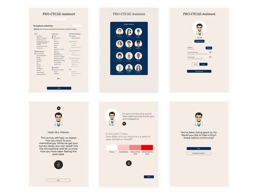
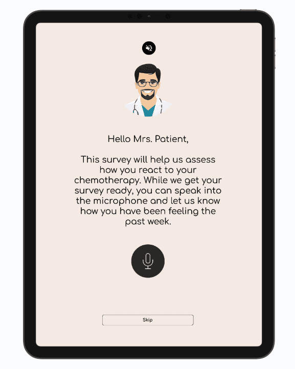
Tablet app
Patients fill out the tablet app upon arriving for their checkup, often fatigued or anxious from chemotherapy, which can affect the accuracy of their responses. To streamline the experience, nurses use a setup screen to customize the survey—selecting symptom presets based on the chemo drug or the patient's EHR number—and choose an avatar to help the patient feel more at ease.
The UI uses calming colors and friendly fonts. Before the survey begins, patients are asked how they’re feeling; the system then prioritizes questions related to those symptoms first, capturing more accurate responses before fatigue sets in. The survey starts with one question at a time, gradually increasing the pace and including a progress bar to keep patients engaged. It also offers breaks and uses color-coded answer options to reduce cognitive load.
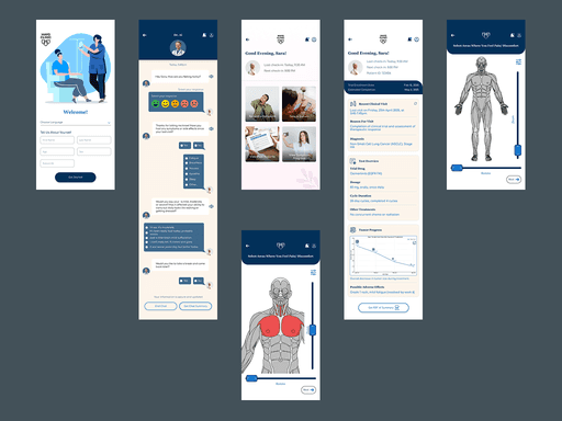
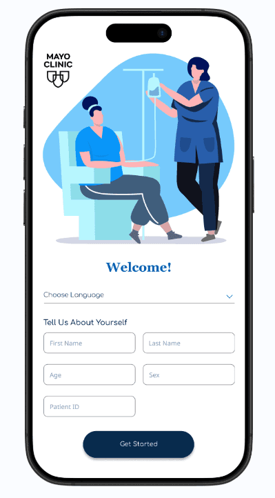
Mobile app
The mobile app allows patients to report symptoms between sessions via a chatbot. They can indicate affected areas using a body diagram, upload photos, or describe their symptoms in text. If needed, they can also fill out the PRO-CTCAE or connect directly with their physician through the app.
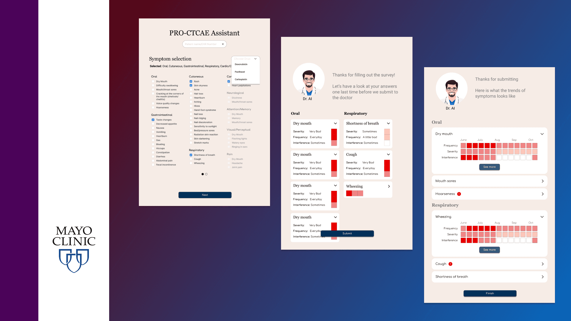
VIsualizing symptoms
Visual design was used to help both patients and physicians report and visualize symptom progression
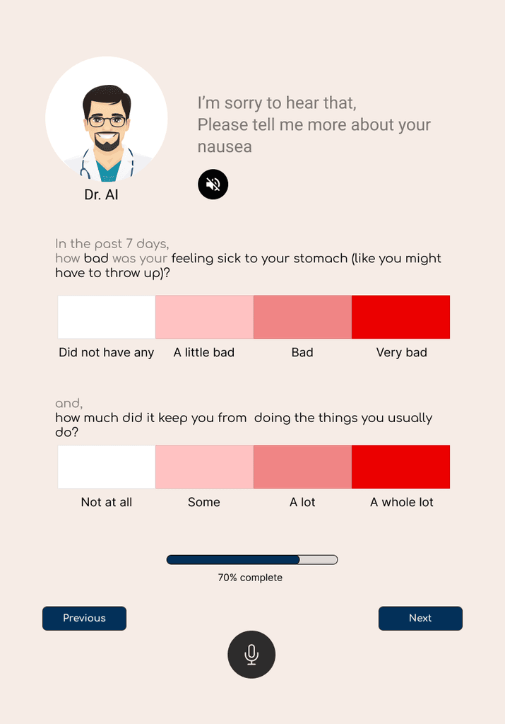
Color coded options
The scales of the answer are color-coded to make it easier to read
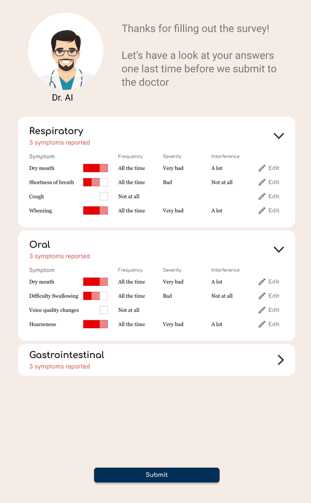
Review answers
The same color-code is used to make it easy for the patient to review answers
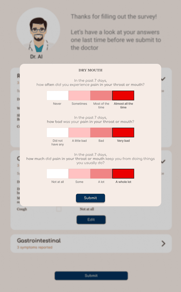
Review answers
Patients can see the answers they selected
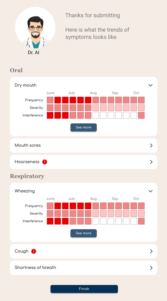
Symptom progression
Patients can view the progress of the symptoms using the color code
Conclusion
This study underscored the critical importance of involving all stakeholders throughout the design process. By actively engaging with physicians at the Mayo Clinic, I developed a deeper understanding of the hospital’s internal systems, clinical workflows, and the real-world challenges faced by both patients and providers. This collaboration enabled us to design solutions that were not only user-friendly but also practical and aligned with existing medical protocols. It reinforced my belief that effective UX design in healthcare must go beyond user interfaces—it must consider the broader ecosystem of care, communication, and emotional needs. The project strengthened my ability to balance empathy, technical feasibility, and stakeholder alignment to create meaningful, impactful design outcomes.
Other projects
Redesign project: fitness tracker App Revamp
HapViz - Visualizing haptic signal descriptions
Redesign project: fitness tracker App Revamp
Helping Cancer patients report and visualize their symptoms

Redesign project: fitness tracker App Revamp
Enabling renewable energy professionals to make critical decisions
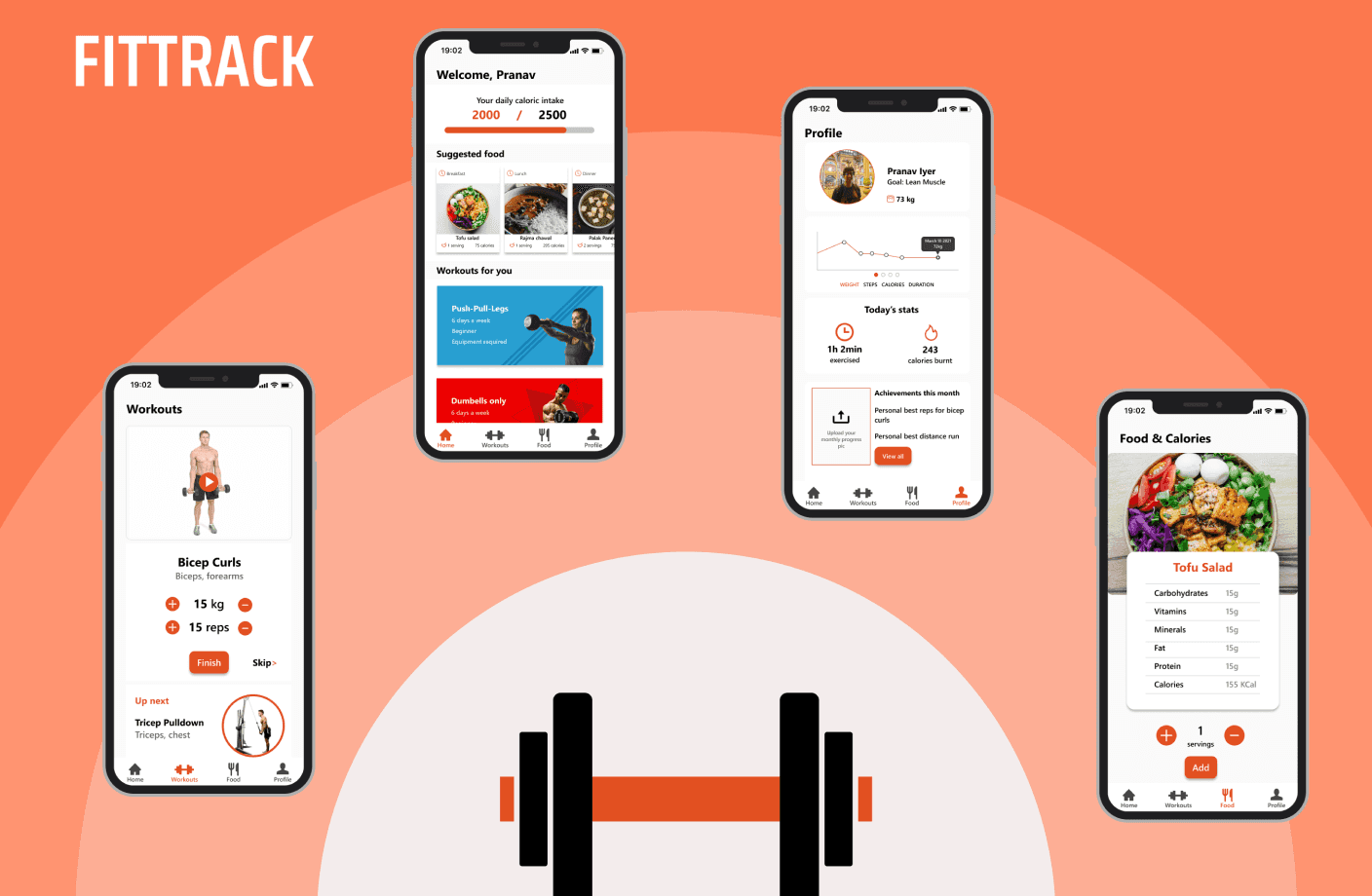
Redesign project: fitness tracker App Revamp
Fittrack - a fitness app